Ask a shopper what a box for a luxury item looks like, and they’re likely to say the color, some foil, or maybe a glossy logo. But go a little further and ask how it felt to open up that box, and you’ll get pretty curious responses. They describe the weight of the lid, the little gentle push of the air as it lifted, how the product sat in its tray as if it were on display.
Looks open the door, but they do not hold the sale. What distinguishes an imposter from a legitimate premium pack is everything that’s not visible to the eye at a glance.
Form: The Silent Indication of Excellence
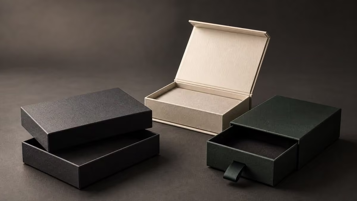
Prior to any else seeing a design, they check to see if the box maintains its form. Hard construction, of dense board covered in paper, quickly communicates to the customer this is not an item to be purchased and discarded. Corners remain sharp. Edges don’t indent under pressure. The lid doesn’t shift easily away from the base.
That’s important because you can’t cheat structure. Thin board can be printed with stunning graphics, but it flexes, bows, and wrinkles at the edges. The customer may not be able to put a reason to it, but she’ll feel it, and she will relate that feeling to the value of what’s inside.
Good structure is also functional. It can safeguard delicate items; it can be stacked in a warehouse, and it can tolerate being stored on a shelf for years. If you store your box, it is a box that helps promote your brand.
Weight and Balance
Grab a box of identical dimensions and the heavier one almost always feels more valuable. Weight indicates substance. The objects are not heavy for their dimensions simply to add weight (increasing its shipping cost) but heavy enough to imbue density.
Balance matters as well. Too heavy a lid and the box lopsides when set down. Too light a base, and it scuds away across the table. Expert crafters balance board thickness, wrap material, and closure type so the box conveys that it’s settled from the first moment you hold it.
The Unboxing Sequence
Luxury is not a one-time event. It is a process, a sequence and we have the sequence just right.
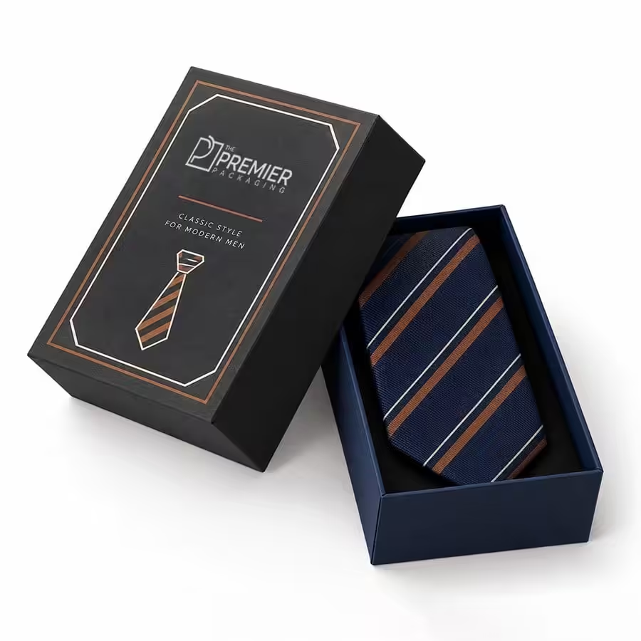
Design. The surface begs to be touched: smooth matte finish, linen texture or embossing of the logo.
The Action. A magnetic flap, a slow-lift lid, or a ribbon pull gives the action a rhythm.
The reveal. The product is housed in a precision-fitted insert, balanced and free of clutter, with room for it to breathe.
The details. A printed message, a folded care card, or a layer of tissue – finishing touches.
Brands that design all four now have a memorable experience to which customers will tell others. Brands that don’t simply have a box they open.
Sensory Details That Words Cannot Capture
Premium packaging speaks to more than sight.
Touch feels like velvet, soft-touch lamination. Embossing and debossing put a tactile edge to your logo. Fingertips feel the heat of a quality company.
Touch: a magnetic closure provides a nice, rewarding click. A close-fitting lid gives off a breath of air. A cheap box scrapes or rattles.
Scent: the aroma of a lightly scented tissue sheet, a whiff of ink or a note of paper.
Sight, with control: a single foil motif can be more opulent than a surface of effects.
These small cues are what people tell you come to mind when they describe a brand as high-end without knowing why.
Attention to Detail
Luxury is mostly about the little details being perfect. Printing is always centered. The paper wrap is so tight that there are no bubbles in the corners. Seams are perfect. The insert is tailor-cut, fitting the product so perfectly that it stays put. The inside of a box is treated as carefully as the outside, often with a printed lining or a contrasting color, revealed only when the lid is opened.
You don’t always get compliments on these things, but you sure know when they’re wrong. A crooked label or visible glue line will ruin all the design effort that went into it in a second.
Purpose: Packaging That Performs
The best packaging has a function as well as a logo. It safeguards, showcases, and reaps an additional round of duty. Boxes that are made to be reused as memento storage, jewelry holders, or desk organizers develop a partnership with consumers long after the deal is finished. A box that remains on a cabinet or shelf shows what the brand is.”
The benefit also provides some cushion for its price. Since packaging can be used long-term, consumers view it as a part of the end product, not as a disposable item.
A sign of quality: sustainability
Responsibility is key to today’s definition of luxury. Customers are interested in whether materials are recyclable and whether inks are water-based and whether the packaging includes extra plastic. Paper-wrapped board, FSC-certified fiber content and plastics-free coatings all reinforce a high-quality image while ticking the boxes of consumers’ new questions.
Honesty is important. A brief, precise description of what you are making your box from is more convincing than sweeping statements that it is ‘green’.
Affordable luxury isn’t impossible
It doesn’t. Sometimes restraint looks more premium than lots of effects and choices. Small and growing brands can get a great outcome from Affordable Custom Rigid Boxes With Logo and a high structure, one statement finish and a simple, clear composition, rather than piling effects on top of each other.
Here is where to spend and where to save:
Cost on: board thickness, a tight fit, and the finish that customers feel (say, the lid surface).
Save on: extra coatings, intricate die cuts, and heavy adornments that will add to the cost of the box without affecting the box’s feel.
Take: the single-color print with the foil logo that is often more eye-catching than a busy full-color design.
Helpful Pointers for Brands Interested in Premium Packaging
Begin by weighing the item. Weigh the article precisely so that the insert will support it with no leaving.
Order physical samples. The screens tell us nothing about weight, feel, or sound.
Close it-test it. Close and open the box twenty times to make sure it still feels correct.
Set a standard. The box, the card, and the tissue should look like they’re from the same family.
Hold the second life. Consider if a customer would want to keep this box; if the answer is ‘no’, what would make it ‘yes’?
Final Thoughts
Attracts you with looks, but it won’t get you loyalty: what they will remember is how the package felt – the reassuring solidity of its construction, the ritual of pulling it open, the love that went into every element, knowing you thought about them before the product even arrived.
Who could argue that luxury packaging is about substance? Nail the structure, the textures and the psychology – and the aesthetics will follow.